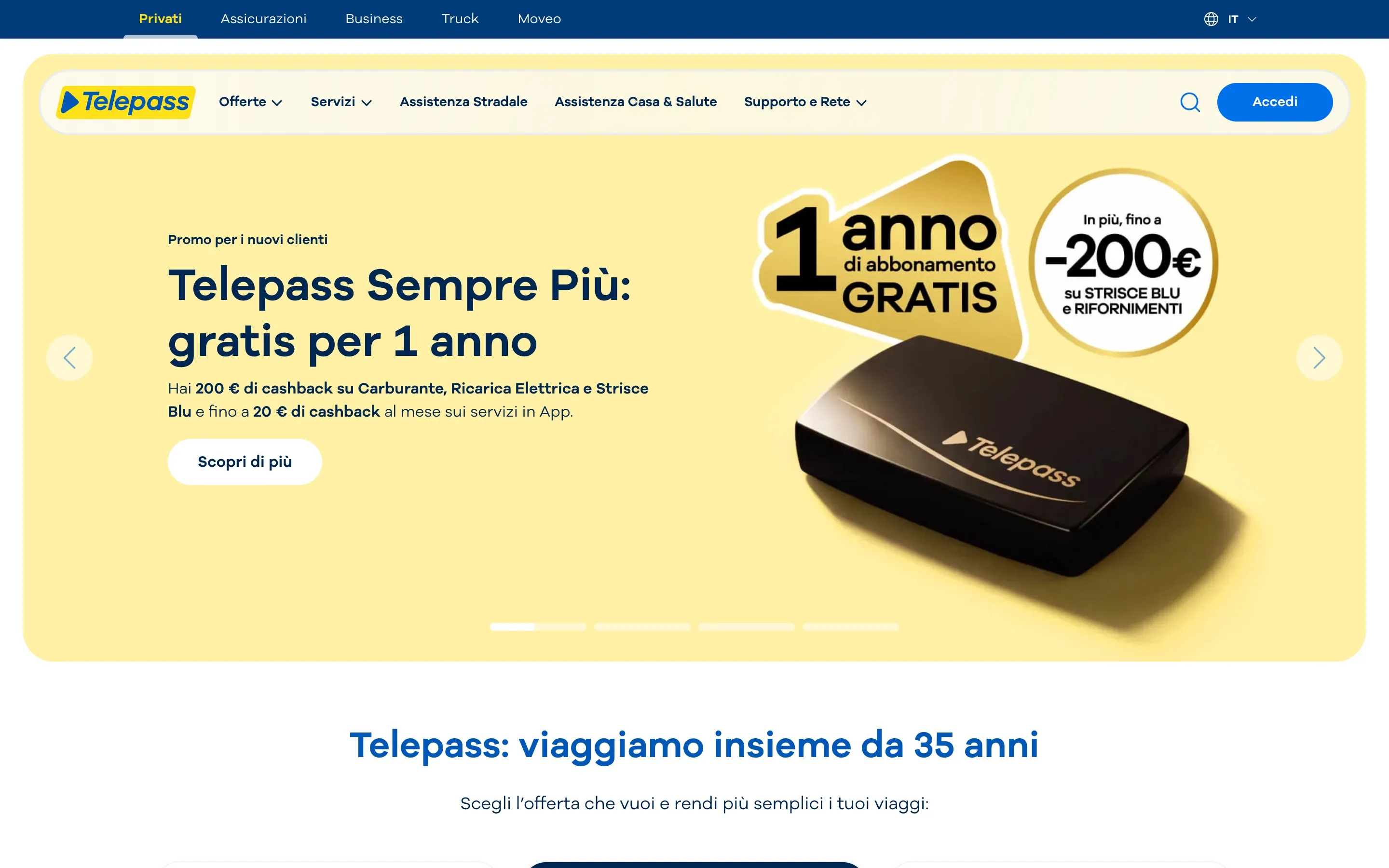
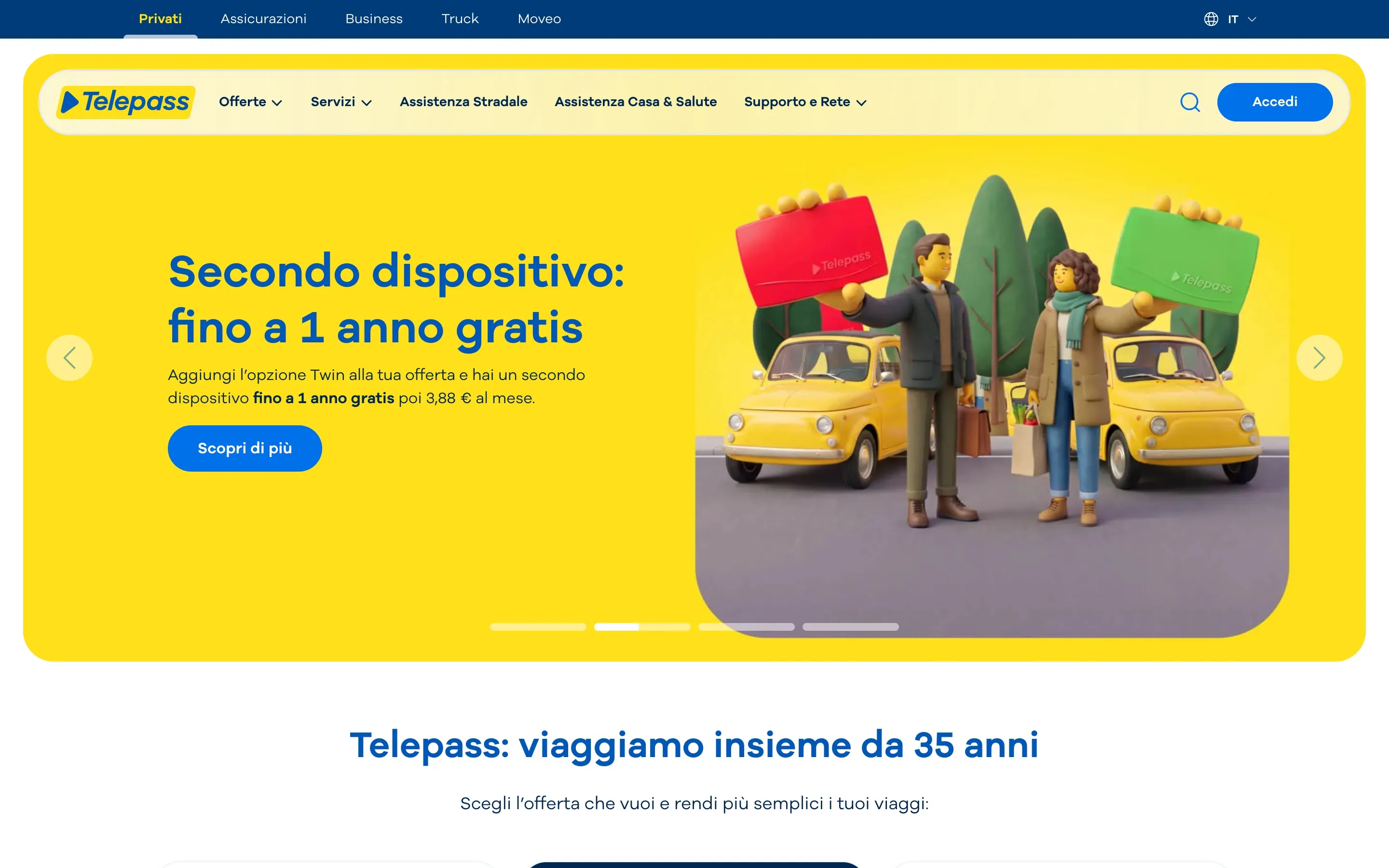
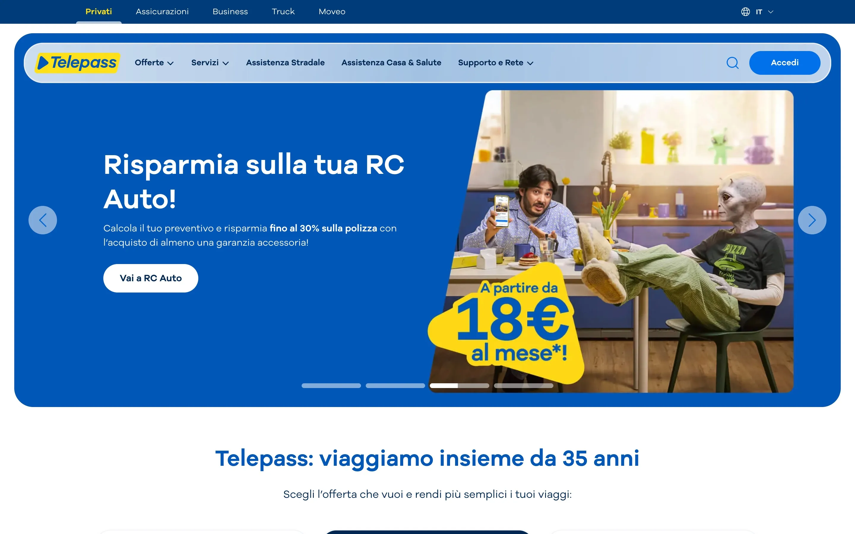
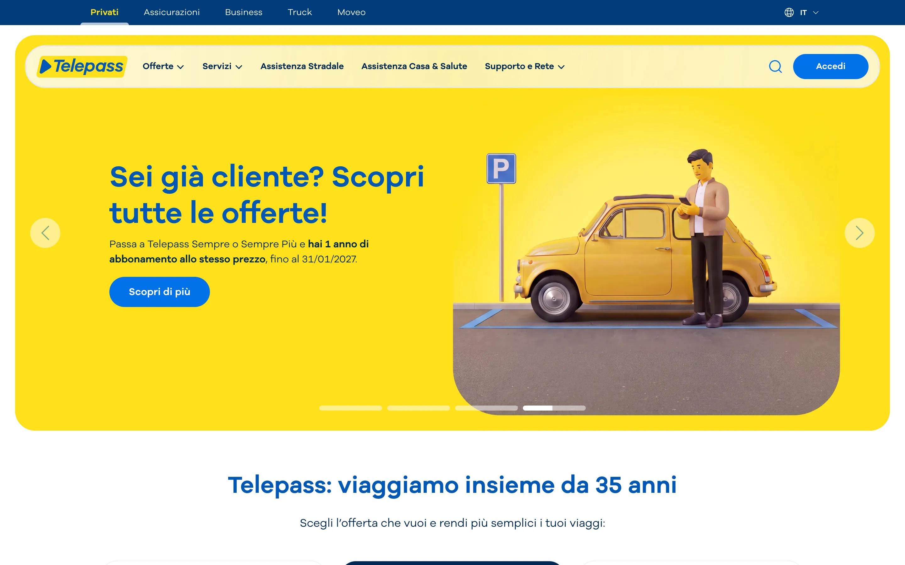
The telepass.com redesign was the heart of my work at Telepass, and it gave birth to Resin, a design system for all the brand’s digital products.
We started from the foundations: foundation libraries with design tokens, primitive colours, a single typeface, and icons and illustrations tied to the services on offer. On top of it, two separate UI Kits, one for the web and one for the app, sharing the same rules but answering different contexts.
With these foundations in place we could simplify: one typeface, the brand colours used consistently and a leaner library. The cards, for example, came in six different kinds, born over the years for different needs: they became three, more flexible, covering the same cases.
Then the most delicate part: replacing the components one at a time, with the site always online. Every release had to be coordinated with content data entry and QA testing, because several teams work on the site every day and no one could stop.