Design system · personal project
Grigna. A design system for designers and AI agents.
A design system serves designers first: it gives designers and developers the same rules, the same names and the same components. Grigna adds a second reader, the AI agent. The rules that keep a team's work consistent are the same ones that stop an agent from inventing colours, spacing and components.
- 3 tiersof tokens, from the raw starting value to the multi-purpose component
- 7 initial componentsin HTML and CSS, no framework, ready to grow
- Light and Dark modesame names, different values
Six principles
Six ideas guide Grigna: the principles that always underpin both the design work and the use of the initial components. When a more specific rule doesn't cover a case, you decide from here.
- 01The system is the context.Every choice is written down, has a name and can be checked by a script, not just by an expert eye.
- 02Clean and bright.Light surfaces, plenty of space, a single accent colour. The UI serves the content, nothing else.
- 03Colour always means something.Fir green signals action. The other colours are only there to give feedback: success, warning, error or information.
- 04Accessible by construction.Contrast, touch area and focus are checked rules, not good intentions.
- 05Fewer choices, more consistency.Spaces, sizes and colours are chosen with a rationale. If a value is missing, it isn't hand-written: it goes into the system, for everyone.
- 06No invented content.Examples use clear placeholders. And missing data isn't shown: no dashes, “n/a” or estimates.
Components
Seven initial components, in HTML and CSS with no framework. Every documentation page has the same sections in the same order: live example, when to use it and when not, code, variants and states, tokens, accessibility, rules for agents.
Pick a component and look at its states. The examples are real, not images.
Every component also says when not to use it.
Accessible by construction
In Grigna accessibility isn't the result of a final review: it's written into the tokens from the start and checked by the build.
- Contrast
- 4.5:1 for text, 3:1 for borders and graphics. If a pairing fails, the build stops.
- Touch area
- At least 44px for every interactive element.
- Text
- Body text never goes below 16px.
- Focus
- Always visible from the keyboard, with the same green ring everywhere.
- Native HTML
- A button for actions, a link for navigation, a label for every field, details for the accordion.
- Never colour alone
- Every meaningful colour comes with text, an icon or a shape.
Try removing the colours: the badge status, the active filter and the error still make sense, thanks to text, check mark and message.
Information carried by colour alone doesn't reach everyone.
A DS for AI agents too
Documentation pages end with a “For agents” section: short rules, exact class and token names, and what never to invent.
- For people
- Why each choice was made, when to use an element and when not, right and wrong examples.
- For agents
- A rules file (AGENTS.md), a Markdown version next to every page, llms.txt and all tokens in a single file.
- An automatic check
- It reads a page and flags every hand-written colour, space or size.
- When the system isn't enough
- The agent doesn't improvise: it uses the closest option and says what was missing. A person decides what gets added.
Always
- Only one primary button per view.
- Text that starts with a verb.
Never
- Never custom colours, borders or spacing on the button.
- Never a clickable div instead of a button.
The rules that keep a team consistent are the same ones an agent needs.
Tokens and themes
Three tiers, from raw value to component. Light and Dark mode use the same names; only the value changes. Standard W3C Design Tokens format.
- 01 · Primitivefir 500
color.abete.500The raw value. Never used directly. - 02 · Semanticaccent
color.accent.defaultA value with a meaning. - 03 · Componentprimary button background
button.primary.bgA component's value. It only points to semantic tokens.
In Dark mode the same accent points to another green, fir 300: the button keeps its name, only the value changes.
Grigna DS put to the test with two AI agents
Does a well-structured design system shape what an agent can build? I wanted to stress-test the UI ideation of a sample page built by two agents, with the same request: a list of cards that can be filtered by the information they contain.
One worked with no framework available, the other with Grigna. Neither had real data. Quite a few interesting reflections came out of it, and I wanted to report them here.
In all honesty: the page without the system looked better, richer and more “product-like”. The system didn't make it prettier. It made it consistent, verifiable and honest.
| — | No reference framework | With Grigna |
|---|---|---|
| Hand-written values outside any system: colours, spaces, sizes | 142 | 0 |
| Different hand-written colours | 44 | 0 |
| Different text sizes | 11 | Grigna's 9 |
| Content | 14 cards with real places and invented information, presented as real | No invented data: clearly recognisable placeholder text and a notice at the top of the page saying the data isn't real |
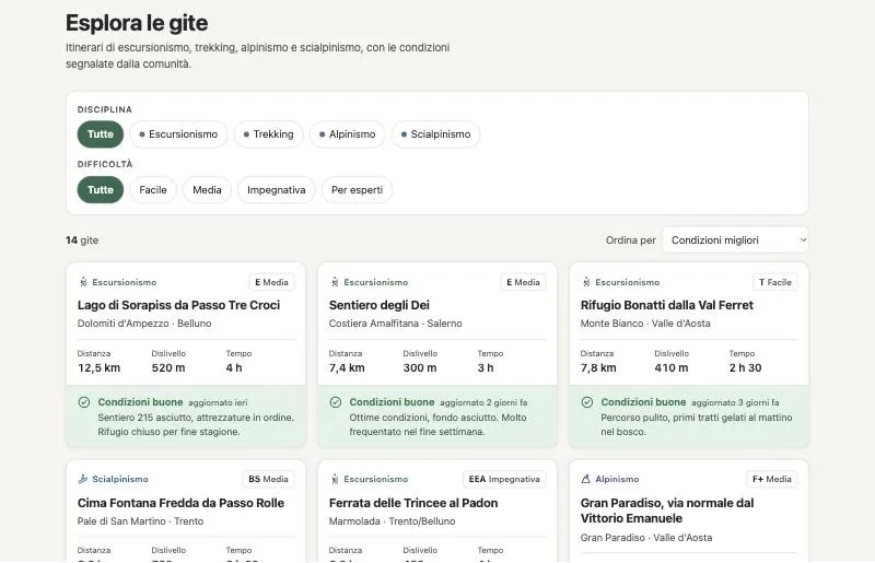
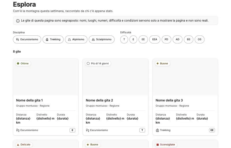
The test also found Grigna's limits. The agent listed what was missing instead of improvising. That led to six changes, already applied to the system:
- 01A placeholder component.The agent had copied the documentation's examples to the screen, code braces included: “{distance} km”. Now there's a Placeholder component with a clear format, and a rule: braces never reach the screen.
- 02The missing layout tokens.There was no token for the page's maximum width or the cards' minimum width: the agent hand-wrote the values and said so. Now they are system tokens, with a breakpoint at 768px.
- 03Components that really hide.Some components stayed visible even with the hidden attribute. Now they all respect it.
- 04A filter that handles many options.A group with 16 options was too long to read and use. Now there's a pattern: options are split into groups and only the relevant one is shown.
- 05A stricter automatic check.The check had missed two values hand-written by the agent with Grigna. Now it also checks widths, grids and braces left on screen.
- 06Clearer working rules.The agent had updated the system's working files on its own, even during the test. Now it only does so when actually working on Grigna.
A convincing demo is not a foundation to build on.